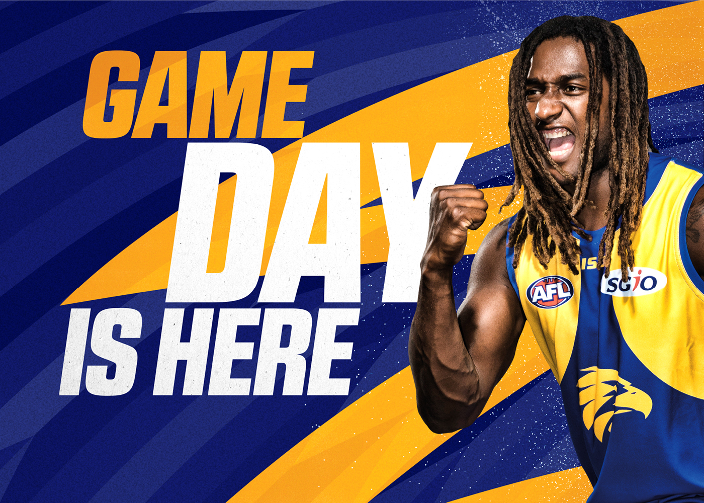
In late 2017, Rare was engaged to rebrand the West Coast Eagles for the first time since 1999. Working to a tight brief provided by the Club, Rare developed a series of creative territories underpinned by the Club’s newly endorsed brand proposition – “Live it all”.
Ranging from ‘refinement’ through to ‘transformation’, Rare developed a series of design brand territories that were presented to a range of key stakeholders – including marketing, events and hospitality, corporate communications, merchandise and operations – all with varying requirements around the brand. Two preferred territories were then comprehensively tested with members, fans and representatives from the community across a range of key brand attributes. The favoured territory was then narrowed down to two final proposed brand identities, which were presented to the entire West Coast Eagles staff, the 3Leadership Team within the playing group, the Board and a select group of West Coast Eagles members of varying ages and backgrounds – to determine the final brand identity to be refined through to approval.
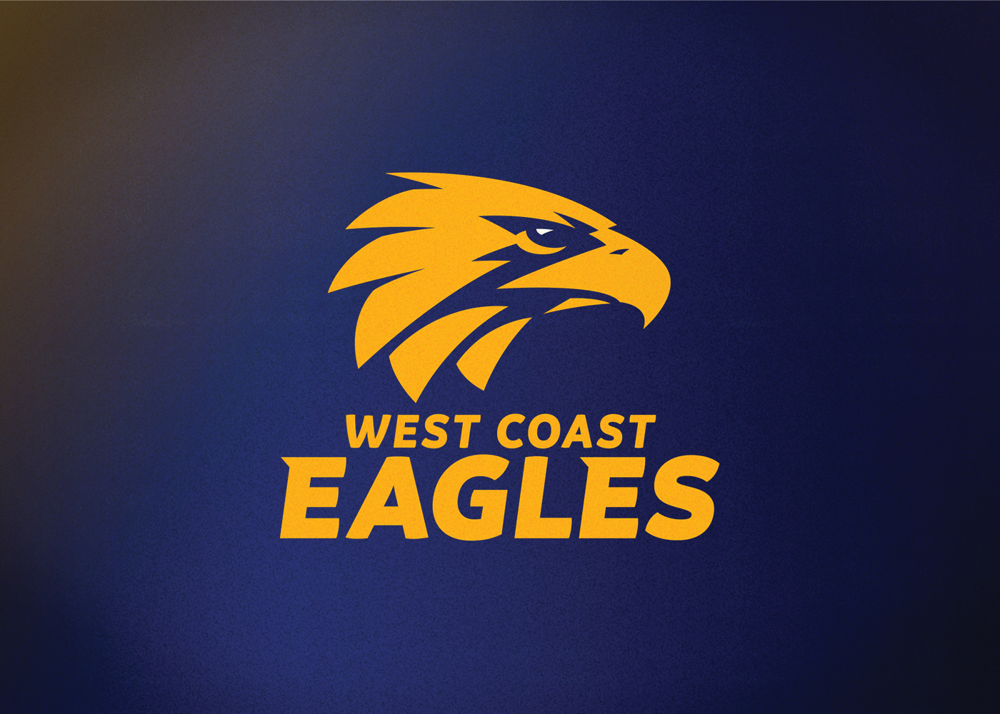
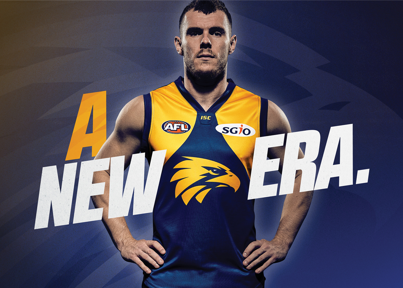

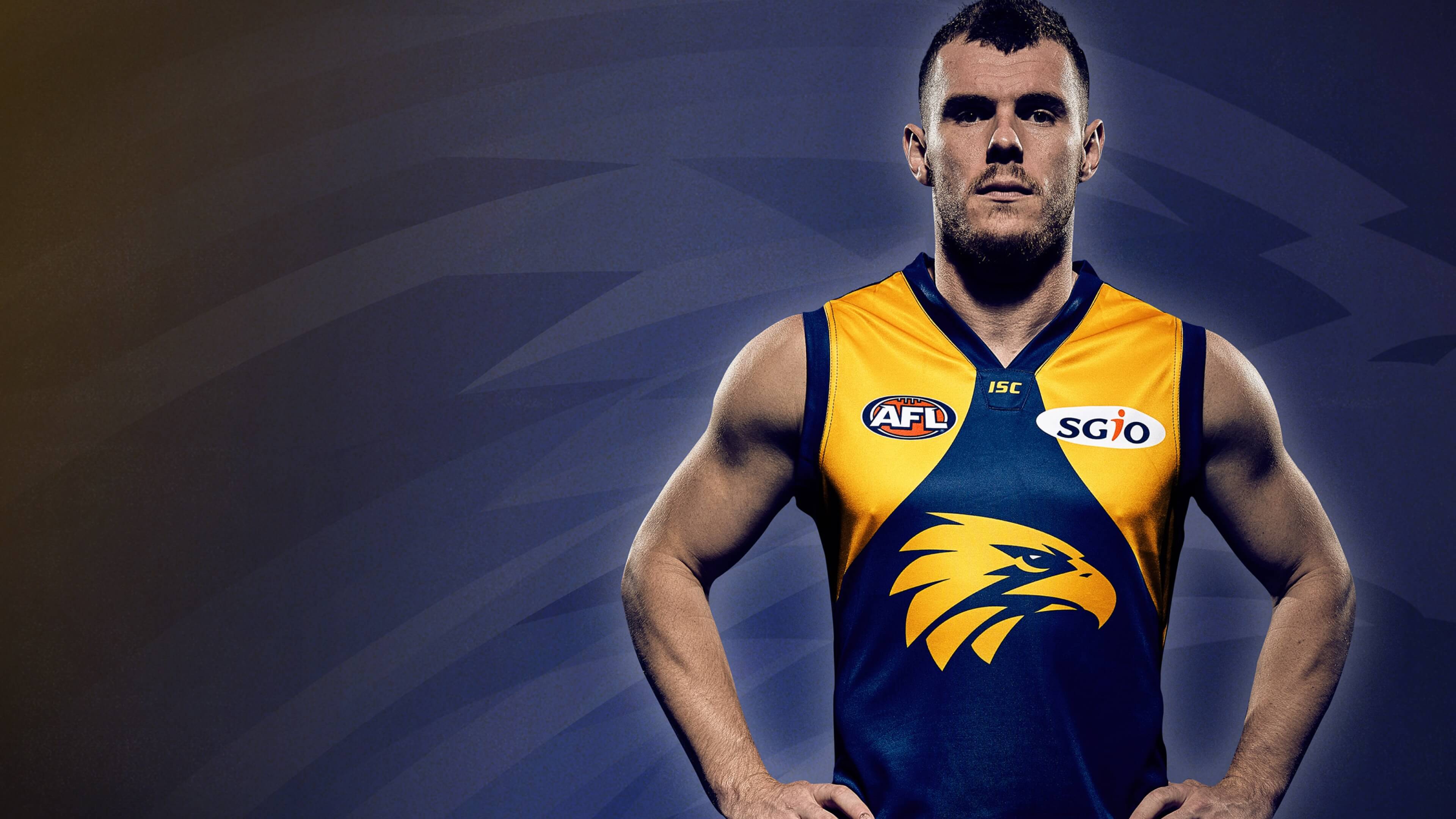
“We needed to strike a balance between realism and dynamism to create a modern brandmark that was also true to the heritage of the Club.”
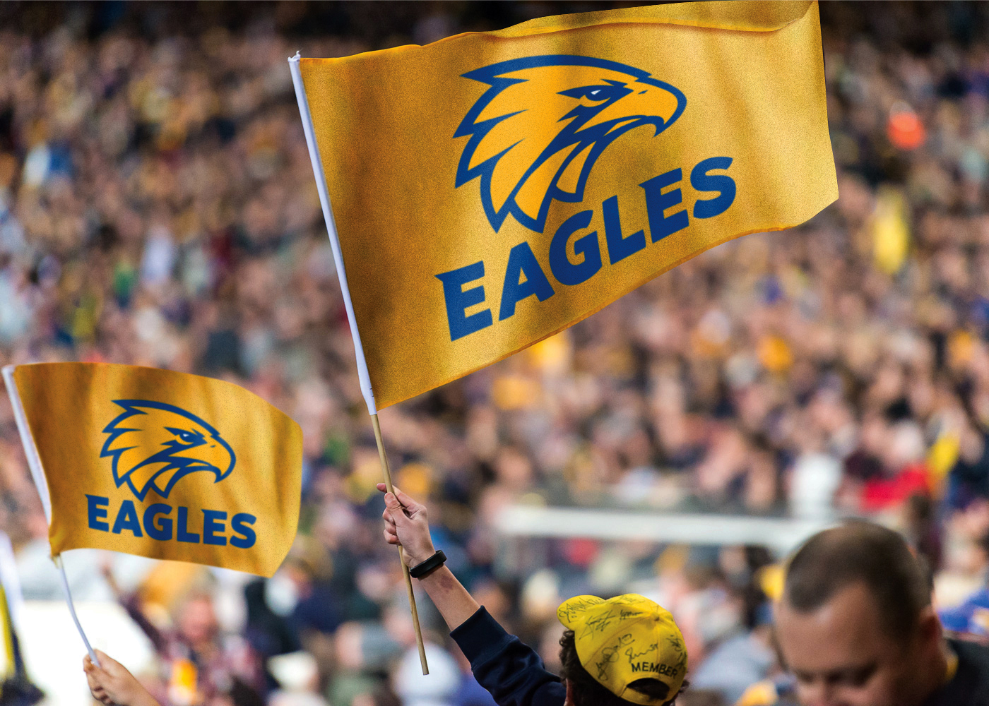
The level of intricacy associated with the design was critical, with key considerations including: — A a to return to gold and royal blue as the Club’s primary colours, with gold to be the hero; — A recommendation from Rare to increase the prominence of “Eagles” within the brandmark vs. “West Coast” to better reflect the Club’s broad supporter base Australia-wide; — The desire for the Eagles icon to be as realistic as possible as a reflection of its significance to the Indigenous community; and — The practical requirement for the Eagles head to face east towards the MCG.
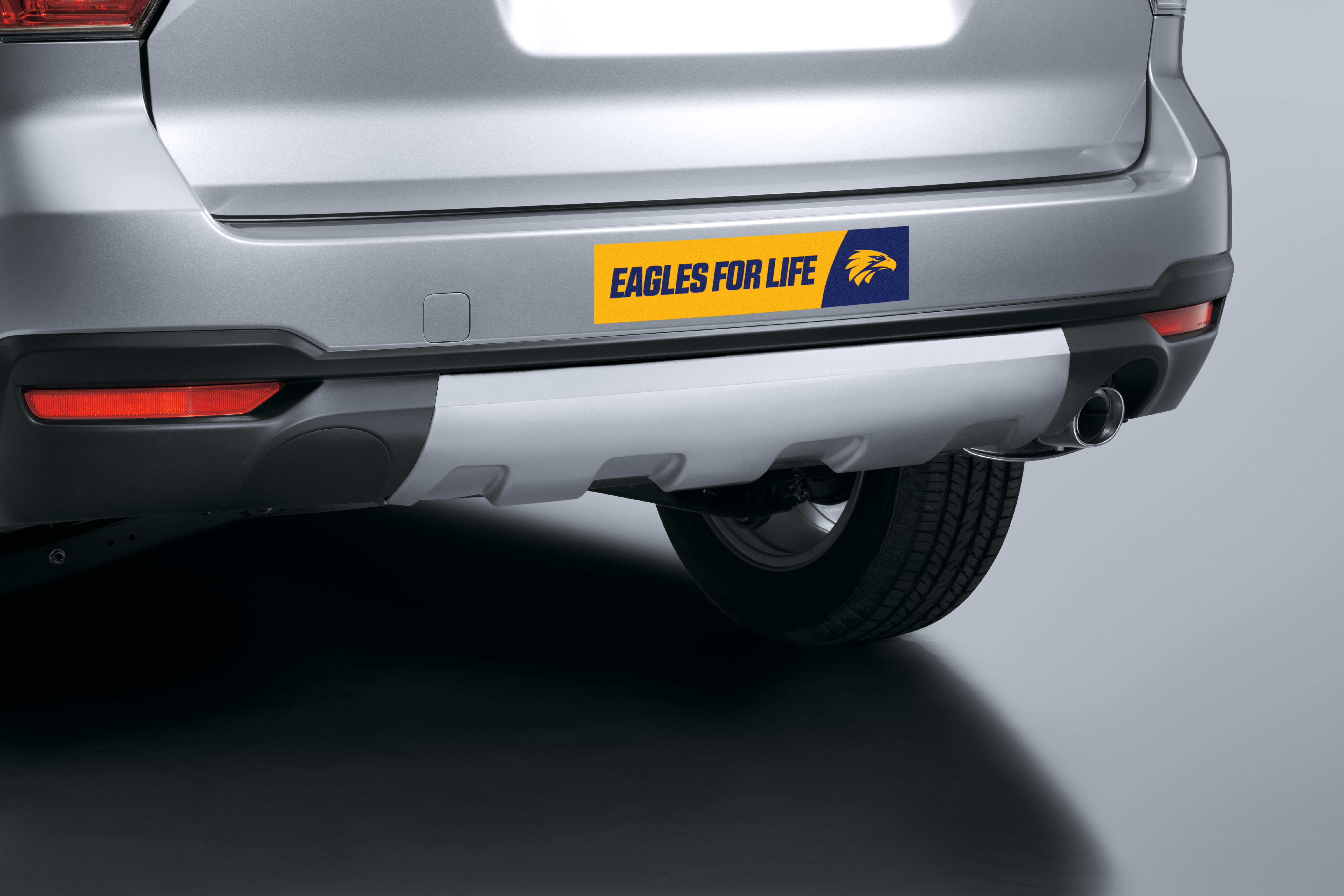
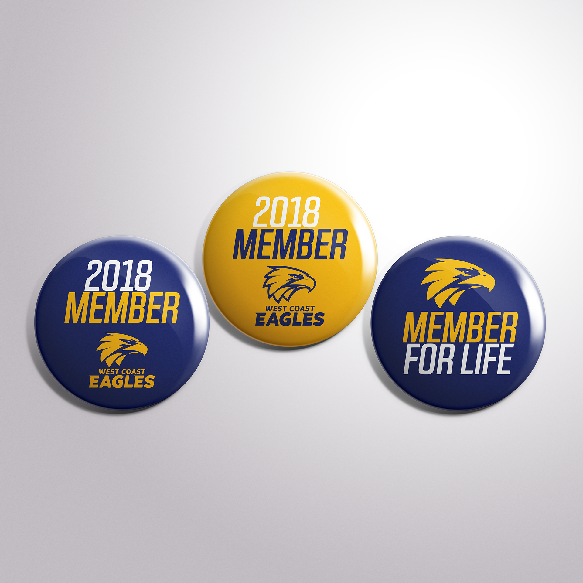
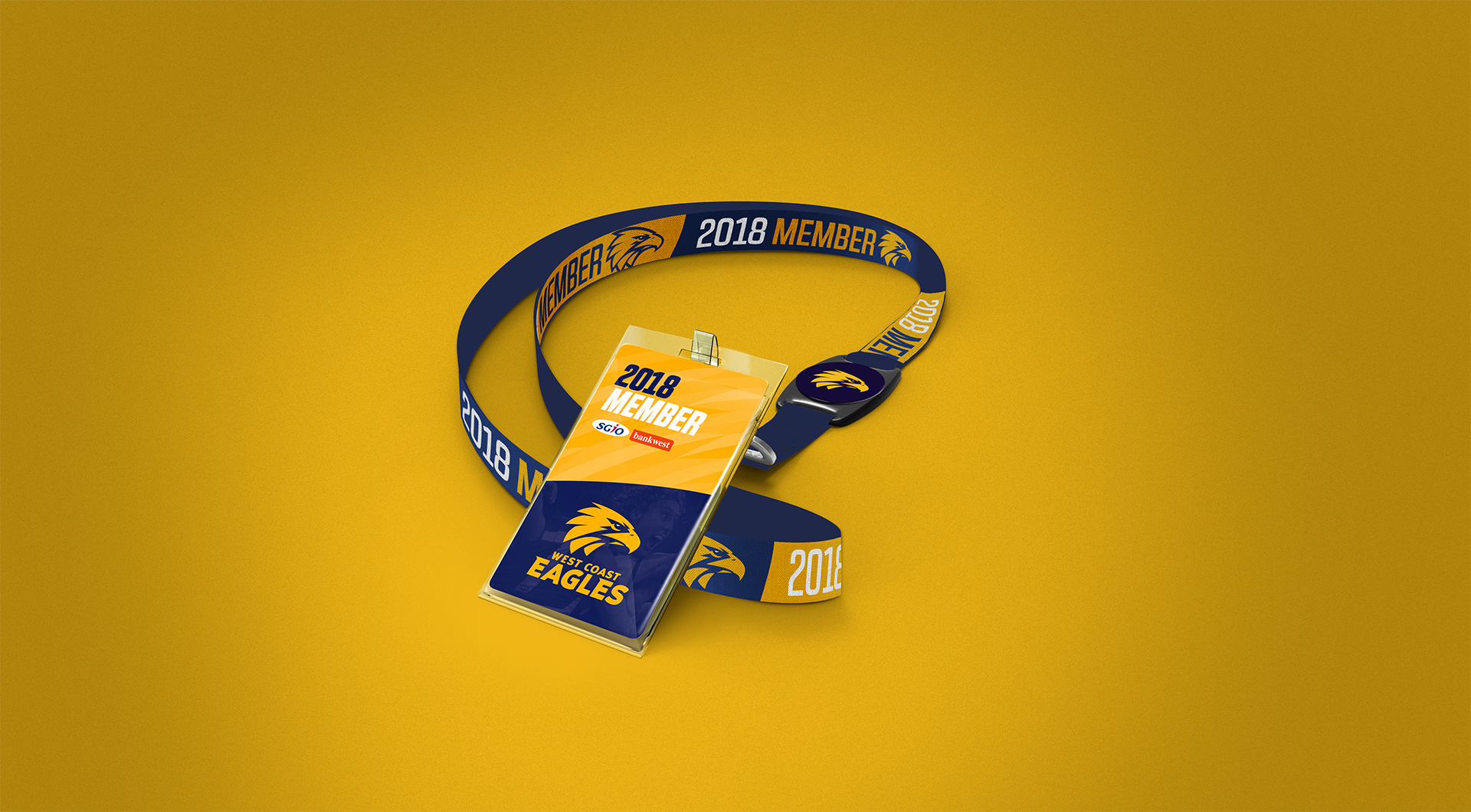
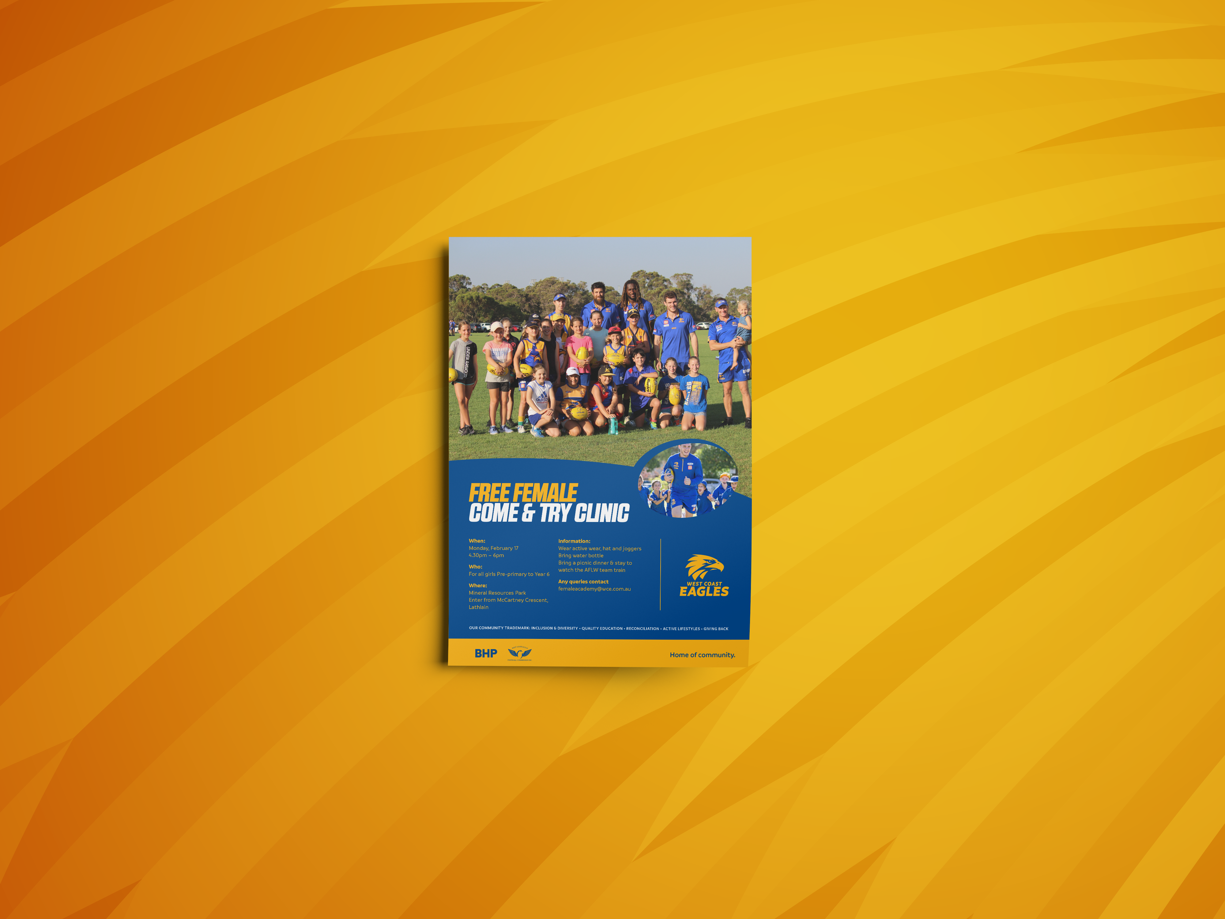
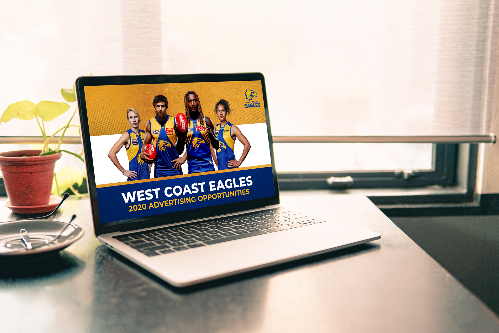
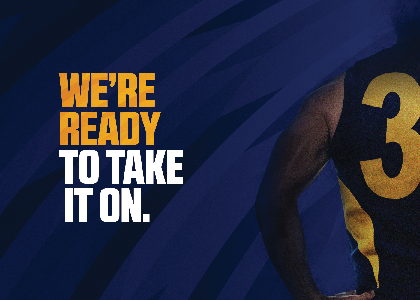
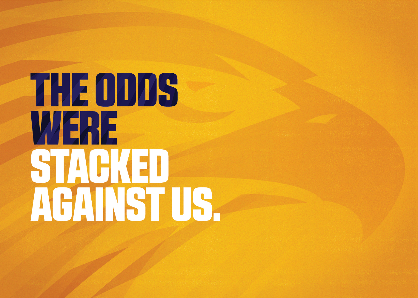
In October 2019 we were re-engaged to develop a suite of new collateral for a range of business units across the club – with examples including administration, merchandise, sponsorships, community and others. We referenced the visual language we created for the brand to ensure brand consistency, whilst giving each new suite of collateral a different look and feel for the respective business units.